

The product
Meet the Waste Hero App
Too Good To Go is a marketplace app that lets restaurants, bakeries, and cafés sell their unsold food at the end of the day as surprise bags at a steep discount. It's a win-win: businesses reduce waste, customers get cheap meals, and the environment benefits.
Browse & pick a store
Find nearby restaurants and cafés with surplus food
Reserve a surprise bag
Pay a discounted price, contents are a mystery!
The store packs your bag
They fill it with whatever's left at the end of the day
Pick it up & enjoy
Head over during the pickup window and rescue your meal
Discovery
From Gut Feeling to Evidence
Before redesigning anything, we started with ourselves. As active TGTG users, we'd lived the frustrations firsthand — and as designers, we had the language to articulate them. Our assumptions weren't guesses. They were informed observations, seen through both a user and a designer's lens.
Desk Research
To pressure-test our assumptions, we scanned App Store reviews and Trustpilot to hear what real users were already saying. The pattern was clear, people weren't leaving because they stopped caring about food waste. They were leaving because the app kept getting in their way.
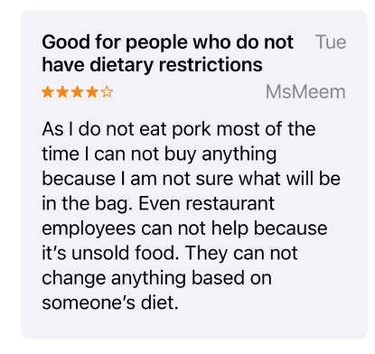
insufficient information about the surprise bags

Limited options for filtering or customizing the Discover page
Lack of trust in vendors or the surprise bags


Unreliable review system
Interview
To go beyond what users say and understand what they actually do, we ran two rounds of primary research. First, a survey with 20 participants gave us a broad view of user demographics, motivations, and feature engagement.
Then, we conducted moderated interviews with 5 users, walking them through real tasks in the app while we observed where they hesitated, made errors, or expressed frustration. The tasks were designed to mirror the real user journey — from searching a new location to completing a pickup — so we could surface friction at every touchpoint, not just the obvious ones.
Define
From Data to People
With research complete, we synthesized findings across both primary and secondary sources, clustering patterns into three core problem areas:
Finding/Browsing Stores
The search experience didn't match how users think. Searching "pizza" should show every store offering pizza — but the app only returns results by store name. On the map, no store logos meant clicking every single pin just to know what you were looking at.
Location Challenge
The app was built around your current location, which left users completely lost when browsing a different neighborhood or city. And once a bag was reserved, navigation broke down entirely — a static map image forced users to jump to Google Maps mid-flow.
Surprise Bag Detail Page
This was the biggest trust bottleneck. No allergy info, no reviews, no way to gauge vendor quality. Users defaulted to only buying from stores they already knew — the surprise should feel exciting, not anxiety-inducing.
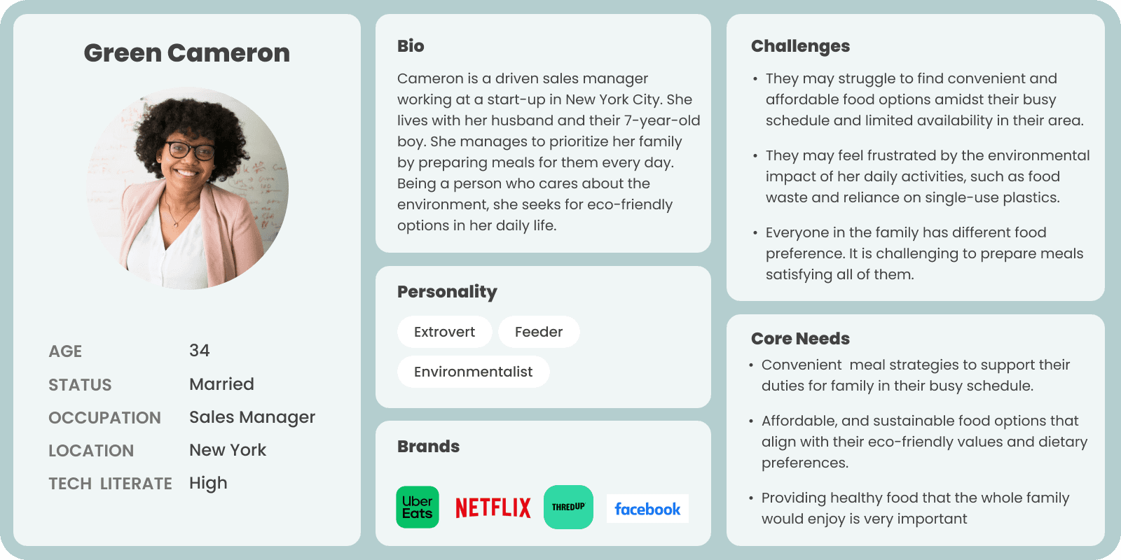
Persona Definition
During our research phase we noticed that there are 2 main archetype of users with different motivation using TGTG. To create a mutual understanding & developing a deeper empathy with the users we defined two archetype:

There's more behind the scenes — empathy maps, user journeys, competitive analysis and more.
Explore the Full Process
Ideation
Sketching Solutions
After finding the main themes of user’s problem, understanding our persona archetype, and reviewing how our competitors are addressing the same user needs, we facilitate a brainstorming & ideation session to develop solutions that address both the business objectives & our user needs.


Testing
The we made prototype from these wireframes and test it with 5 users.
Prototype
Final Design
Define
Key Takeaway
Real validation hits differently. Weeks after our redesign, TGTG added store logos to the map — one of our core suggestions. Research-backed decisions hold up.
Neutrality in research is a skill. Showing empathy toward a frustrated user subtly steered the conversation. The way you ask shapes what you hear.
Trust is a design problem. In marketplace apps, confidence to try something new is built through details — reviews, transparency, clear information.
Six designers is a coordination challenge. The best ideas came when we had clear frameworks for deciding together, not just diverging and hoping it clicked.
Thank you for reading :)
Psst, you've reached the end...how about another story?
